The Brief
Design a product or service that reduces exclusion in modern society. My question became: how might we correct the misconceptions about visually impaired people to create genuine mutual understanding — not just accessibility for its own sake?
I spoke with visually impaired young people — students and professionals with active lives. They described strangers grabbing their arm without asking, people overestimating their dependence, and a frustration at being defined by a disability rather than seen as a person first. The insight that shaped everything: sighted and visually impaired people share almost everything — emotions, memories, touch, smell, sound. Sight is the only exception, and that became the opportunity.
The process
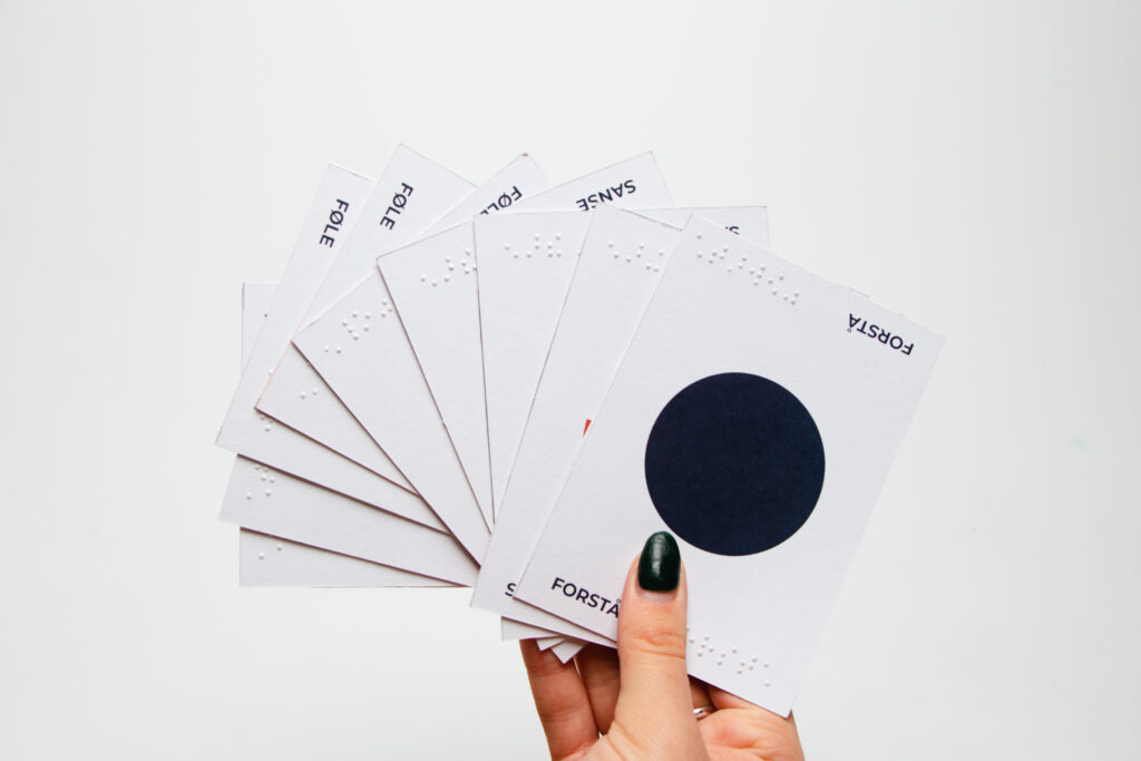
- Participatory co-design research Ran interviews, observations, and material experiments alongside visually impaired participants at every stage — not as subjects, but as co-designers and experts of their own experience. Also consulted Christel, a blind therapist, to validate the concept direction.
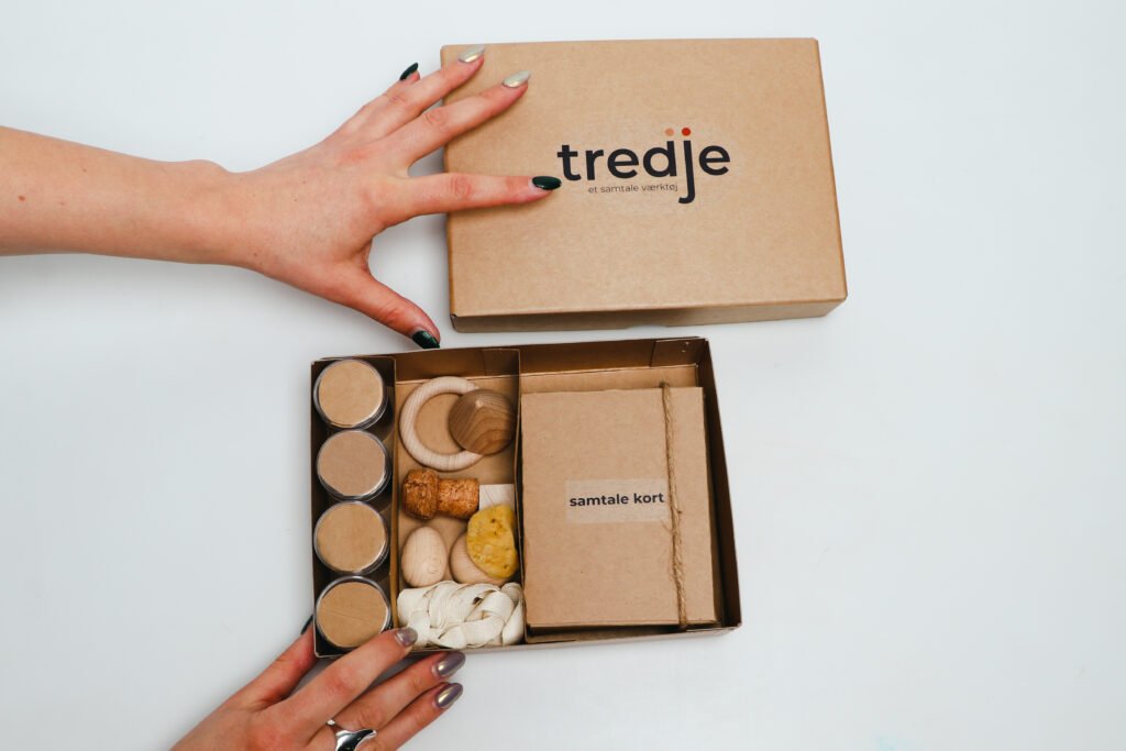
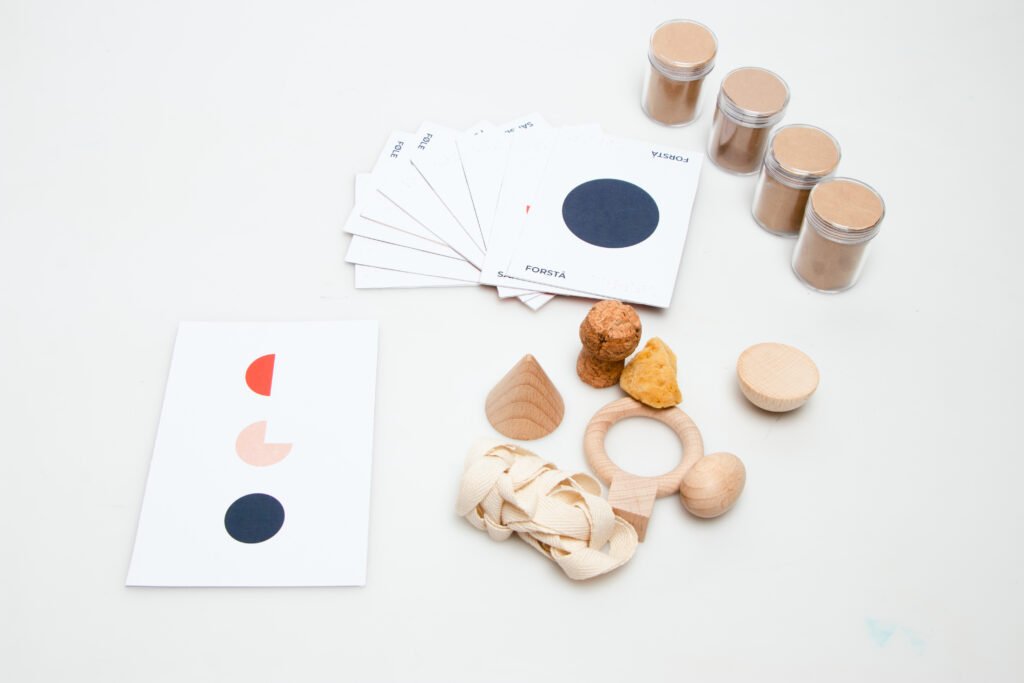
- Material & sensory prototyping Built material probes to test paper textures, color contrast, typography sizes, and tactile differentiators with real participants. Insights directly shaped final card and object design choices.
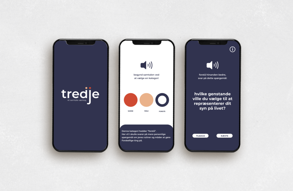
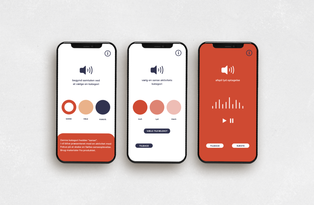
- Product & system design Designed the full toolbox: three conversational card types (sense, feel, understanding), curated scents and tactile objects, and a supporting app for participants who don’t read Braille — ensuring the tool was fully accessible across the community.
- Brand identity Created a concept-led visual identity: a clean sans-serif wordmark chosen for legibility, with two dots above “dj” encoding the number three in Braille. The circular icon system references Braille’s dot structure. Meaning is structural, not decorative.
The thinking
The name “Tredje” comes from the social pedagogy concept of a common third — a shared object that creates the conditions for connection between two people. That concept became the product logic: instead of educating sighted people about vision impairment, the tool creates a shared sensory experience between them. Empathy follows from that exchange naturally.
The Braille encoding in the logo works the same way — it’s not a reference to blindness as aesthetic. It’s a dual-register system: readable by sight and by touch, mirroring exactly how the product itself is designed to work.